Appeal to Target Audience
Appealing
How did you attract/address your audience?
My specific target audience was 18-26 who had an interest in indie/mainstream music. I appealed to them in my magazine through layout, images, fonts colours and of course topics in the magazine.
Front cover:
I used the route of the eye for my front cover. I put the title of the magazine at the top. It would then go down across and it goes across the bands face, then down to the bottom for the coverline. This is done so that it is easy for people to see everything on the page.
I used the hotspots to cross on the bands faces, so that it is easily seen. The other hotspots are on the bottom of the page on the coverline. I made it like this so that it would be easy to see and clear.
I used these fonts because it helps them stand out from the background. Having the black font behind the coloured makes it a lot more contrasting and easier for the audience to see at a glance. It makes it stand out too. I used the white font so that it stood out from the main picture and didn’t just blend in. I used the turquoise so that it blended in with the scarf and made it look like it was made to blend in with the scarf, also so that it would stand out from the rest of the background.
The image is a conventional indie image. It is very conventional with the clothes used.
I used the route of the eye for my contents. I put the title of the magazine at the top. It would then go down across and it goes across the main story, then down to the bottom for the cover stories and page numbers and tomy smaller story and image. This is done so that it is easy for people to see everything on the page.
I used the hotspots to cross on the bands faces, so that it is easily seen. The other hotspot is on the main story description and on the bottom of the page on the cover stories. I made it like this so that it would be easy to see and clear.
I used these fonts because it helps them stand out from the background. Having the black background behind the coloured makes it a lot more contrasting and easier for the audience to see at a glance. The red on the white background is used to make the names stand off the page and contrast with the black page numbers.
The image is a conventional indie image. It is very conventional with the clothes and equipment used.
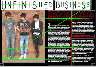
I used the route of the eye for double page spread I put the title of the band at the top. It would then go down across and it goes across the standfirst and main picture, then down to the bottom to the main article. This is done so that it is easy for people to see everything on the page.
I used the hotspots to cross on the bands faces, so that it is easily seen. The other hotspot is on the standfirst and on the main article. I made it like this so that it would be easy to see and clear.
My target audience thinks that my magazine is conventional.
They also believe that the colour scheme is appropriate.
My fonts are all very appropriate.
My target audience think my front cover is very good.
The majority think my contents page is excellent.
The majority also believe that my double page spread is excellent.


No comments:
Post a Comment