The colours of the contents page are very contrasting. They use white, red and black on each other and to make the writing stand out. The bold black writing in the middle of the page makes it clear what the main story of the magazine is.
The layout of the contents page also uses route of the eye and principle of thirds. The route of the eye starts of on the title of the magazine then across to the cover stories at the side. It then goes down across the photos and the main article, then to the band index on the side, finally it goes across the advert to subscribe to the magazine. The hotspots are on the main story, the cover stories and the two main pictures.
The image a picture of a band playing instruments. This is done to make it clear to the audience what the magazine is about.
The font is sans serif. This is done because the contents page is made to make it clear what is where in the magazine, so the font has to be clear and simple to read.
This contents page looks formal. The images are formal, having musicians is formal, the font is formal too.
This is the front cover of NME.
The colours are bold and stand out when put on each other. The use contrasting colours all over the magazine to make it stand out. For example the red of “NME” on the white background, and the white and yellow “massive review issue” on the black background. This is done to make the headlines stand out from a distance.
They use the principle of thirds on the frontcover. The hotspots are based upon Pete’s face , the cover line and Carl Barat. The route of the eye is used on the front page. They have the masthead, then it cuts across Pete’s face , then acorss the main title, then the coverlines at the bottom. This makes it very clear for the reader what is in this magazine, so they don’t have to spend long looking at it.
The font is sans serif, this is done so that the magazine looks simple and it is clear to read. The size of the font is quite big on the main cover line and masthead to make it clear ad easy for the reader to read.
The images are every stereotypical for an indie genre magazine. The picture is of The libertines drinking and smoking, this is very conventional for the indie lifestyle. The coverline images are close ups of bands, which is obviously ideal for an indie magazine.
The mode of address is very informal as it has the stars smoking, drinking and having fun, as though they were partying. This makes it feel very informal
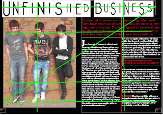
This is a double page spread from NME. The colours used are contrasting like the front cover. This is done to grab the readers attention and make them want to read it. The use of the black on the light blue, and black on white background really helps to do this.
The layout of the page uses the route of the eye and the principle of thirds. The route of the eye goes across the bands name, then across to “what everyone’s talking about”, it the goes diagonally across the small picture, near the quote from the band and across the picture, it then goes across to the “need to know..”. This is laid out like this to make sure the reader sees everything on the page. The hot spots of the principle of thirds is used well by having one near the main picture, one near the small picture, one near the main article and another on the “need to know”.
The font is sans serif, this is done so that the magazine is clear to read. The size of the font is quite big on the main cover line masthead to make it clear ad easy for the reader to see what the page is about.
The article is informal, this is clear by the pictures of the pictures behind the band of the women. This is done to show us they are stereotypical teenage boys. But it is also inappropriate for some audiences


